Brand guidelines · v1 · November 2026
A brand that reads like a flow.
MV, for Martí Villalba, drawn as a process: a starting point, a path and a destination. It's what I do with products, from the problem to the metric.
01 · Concept
Start, path and destination.
The symbol grows out of the monogram of my initials. The M and the V are written in a single stroke that starts at a solid node and ends in a hollow ring, like in a flowchart.
Start node
Solid. The problem, the starting point. Always bottom left.
Path
The M and the V in a single line of constant weight, with the same rhythm between peaks and valleys.
Destination
Hollow. The result, the metric. Always top right. It's the only element that can take colour.
02 · Construction
Geometry guided by φ, adjusted by eye.
The symbol is drawn on a height of 100 units. Round shapes overshoot the guides by 2% so they look the same size as straight ones.
- Overall proportion: golden rectangle squared (2.618 : 1), including overshoots.
- The line starts with a vertical stem: that's what makes the M readable.
- All diagonals share the same angle and the rhythm between peaks and valleys is constant.
- Peaks have a larger radius (24) than valleys (20): it breathes at the top and settles at the bottom.
- The nodes measure φ times the line weight, so they read as dots rather than dumbbells.
03 · Versions
One shape, four uses.
The main version is ink on bone. The destination ring can be blue when the logo sits alongside product content or calls to action.
Main · ink on bone
Inverted · bone on ink
Accent · blue ring

Horizontal logo · Inter Tight 600
04 · Clear space and minimum size
Room to breathe and a minimum that's respected.
The clear space around the symbol equals the node's diameter (x). Nothing enters that zone: no text, no borders, no other logos.
Symbol: at least 40 px wide on screen, 12 mm on paper.
Logo: at least 140 px.
Below that: don't shrink the symbol, use the connector.
05 · Size system
Each size has its own drawing.
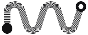
Below 48 px the logo isn't scaled down: a piece drawn pixel by pixel keeps the idea with fewer strokes.

Connector · 16–32 px
Favicon and tabs. 16 grid: 2 px stroke, 5 px node and 6 px ring.

Crop · 48–180 px
App icon and social profiles. The flow runs off the frame: you see the start and the M.
Full logo · 200 px or more
Header, documents, presentations and social media. With the name when there's room.
06 · Colour
Two inks and a hit of blue.
The brand lives in ink and bone. Blue is an accent, not a background: the destination ring, links and a single action per screen.
07 · Typography
Three families, each with its own role.
All are free and served from this domain.
Aa
Inter Tight
Headings (500, tracking −3.5%) and the logo name (600, −1%).
Aa
Inter
Body text (400, 16–19 px, line height 1.6) and buttons (500).
Aa
JetBrains Mono
Uppercase labels (12 px, +8%), data and code.
08 · Motion
The logo runs like a flow.
The animation tells the idea without explaining it: the start appears, the path is drawn and the destination is reached. It lasts 2.25 s and plays only once.
- 0–0.35 sStart. The start node appears, growing from 40%.
- 0.35–1.95 sPath. The line draws from start to end with a cubic-bezier(.65, 0, .35, 1) curve.
- 1.9–2.25 sDestination. The ring appears and closes the flow.
- AlwaysRules. No loops or bounces. If the system asks for reduced motion, the logo appears still.
09 · Incorrect use
What not to do.
Don't stretch or distort
Don't rotate
Don't swap the nodes
Don't apply gradients or shadows
Don't change the line weight
Don't use on low-contrast backgrounds
10 · Downloads
All the files.
SVG vectors for any size; PNG only when the platform doesn't support SVG.



Code for the <head> of any page
<link rel="icon" href="../../favicon.ico" sizes="48x48">
<link rel="icon" href="../../favicon.svg" type="image/svg+xml">
<link rel="apple-touch-icon" href="../../apple-touch-icon.png">
<link rel="manifest" href="../../site.webmanifest">
<meta name="theme-color" content="#F6F6F4">